November 17, 2016
Piotr Niklas – Graphic Designer at His Home in Warsaw
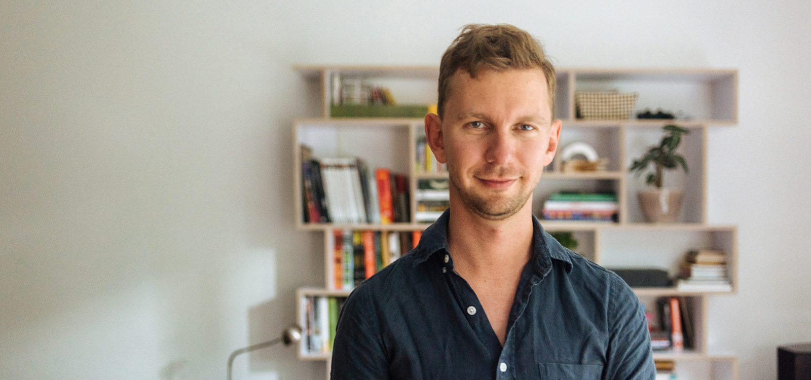
Warsaw’s Piotr Niklas on his graphic design career, the city’s creative scene and his “organic” approach to interior furnishing.
With a discipline-spanning portfolio under his belt that ranges from classic visual identities to masterful motion graphics, Hydra Studio co-founder Piotr Niklas reveals his sources of inspiration – and his surprisingly laissez-faire approach to home styling.
When did you realise you wanted to be a graphic designer?
P: I always find it difficult to answer this question [laughs]. Mainly because I’m one of those really lucky people who knew from very early on what they were going to do in their lives – even as a kid! When I was about 10 years old I started a school newspaper – it never got published but I was so excited to be able to edit the whole thing and work on the layout.
You do graphic design, art direction, websites and app design, concept art, animation…it’s like six portfolios in one! How did you get into all of these things?
P: Just after finishing university, together with a really good friend of mine (and one of the most talented illustrators I know, Benedykt Szneider) we founded an art direction studio called Hydra. We’ve worked together for the last 7 years, and from the very beginning we didn’t really want to limit ourselves, so would take on any project we felt drawn to. We tried to provoke, and worked with brave concepts and unusual ideas. A few of our early projects received international awards, which helped us to gain some recognition – and gave us the freedom to explore all these new creative directions. Benedykt and I eventually parted, but, for me, it’s still all about exploring what interests me the most at that particular moment in my life. For example, right now I want to go back to the bare basics of graphic design – I miss that.
Warsaw’s creative scene is on the rise. Has it really changed that much over the last few years?
P: Well, in my opinion Warsaw has always been an incredibly vibrant and exciting city – it’s just no one really spoke about it loudly before. It has always had a group of creative professionals who did some amazing projects and worked with truly breakthrough ideas. Many of them have this unique ability of sensing the new and the cool – exploring novel aesthetics and concepts way before everyone else catches up. I think that’s the biggest strength of our local creative scene. I considered going abroad but to be honest, I don’t want to leave – Warsaw is just a really great place to live and work.
Apart from the city and people you surround yourself with, where else do you look for inspiration?
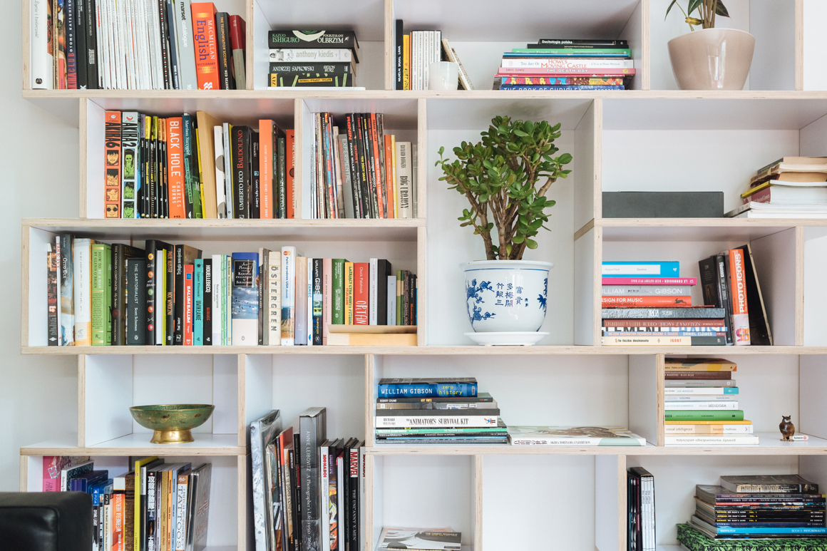
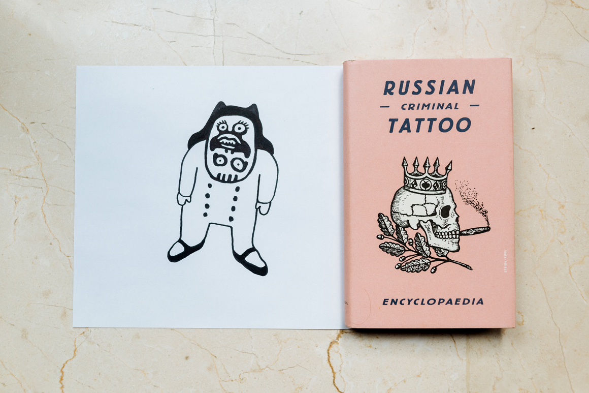
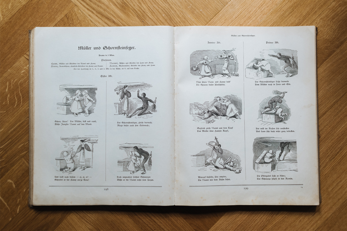
P: I don’t think it would be possible to pin down one exact source of inspiration of my work. But pop culture has definitely always had a big influence on my artistic direction. When searching for ideas, I also like to look back at the classics, works from the past. I have a whole bunch of books and albums on the topics which interest me the most – like this old German comic book, the first one ever created. Or Japanese artwork – I like their overall aesthetics and simplicity.
You now work from home. Has that changed the way you organise or think about your space?
P: For a very long time I really didn’t care about how my apartment looked. I was always at the office and I just didn’t spend too much time in here. I know this is not what you probably expect to hear from a person who works with aesthetics and design on an everyday basis [laughs]! But this has definitely changed since I started working from home. You know, the apartment has suddenly become my creative hideout. I want to be surrounded by the things I actually like and appreciate.
And it very much seems like such a place! Your home is a real hodgepodge of curiosities and great pieces of furniture.
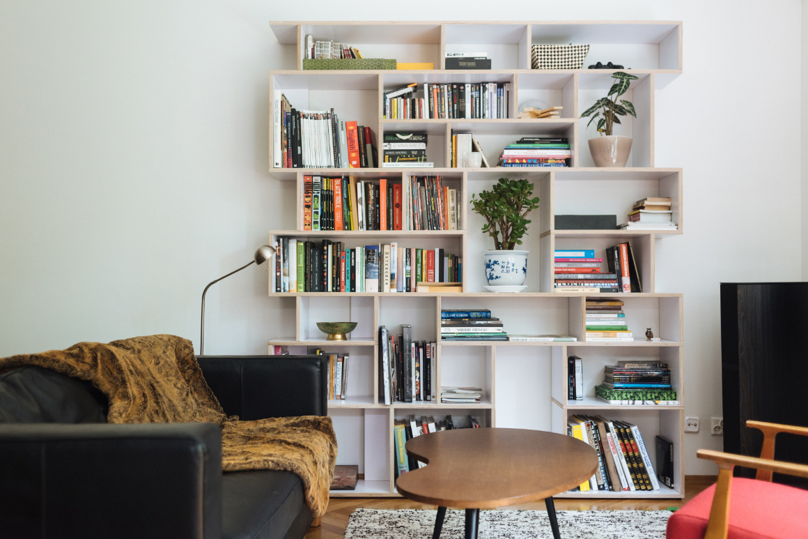
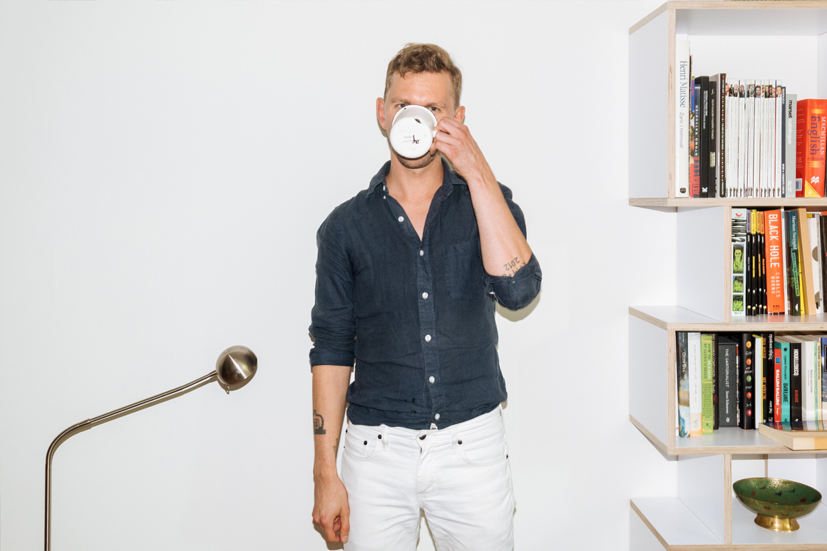
P: When I started thinking about how I would like this place to look, I really didn’t want to go for one particular style. It all happened very organically. I got these two beautiful armchairs from my grandparents and that bean-shaped table from my old office and they kinda influenced the overall vibe of the apartment. It ended up being quite 60’s-like and vintage-y which I didn’t really aim for – but I like it now. And then I started adding all these new pieces, like the Tylko shelf. But do you know what’s funny? A friend of mine who saw my Tylko shelf just after I got it said that it also has a bit of that 60’s graphic vibe to it – almost Mondrian-like. I must have a soft spot for such aesthetics that I’m not even aware of [laughs]. I’m really enjoying filling my apartment with pieces which not only look great, but are wonderful examples of old and new Polish furniture design, too.
You can learn more about Piotr’s work and current projects at www.niklas.ac
