June 27, 2022
How to elevate a room with creative consultant and colour expert Michael Dansk
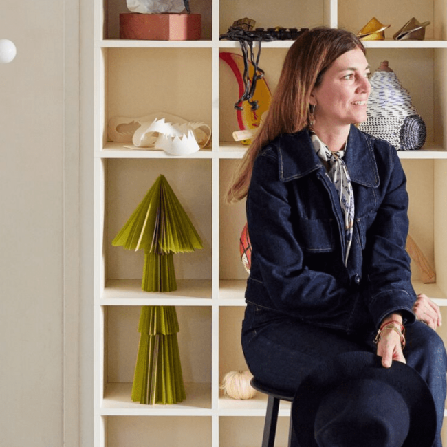
Michael Schmidt, mostly known as Michael Dansk, approaches his work as creative consultant, interior designer and tastemaker, both rationally and emotionally. Throughout his career he has gained a deep awareness of what works and what doesn’t, and instead of just following trends, he’s learnt how to follow his gut.
When we think of stylish, colourful homes, our mind goes directly to Michael Dansk and his teal green ceiling (for those wondering, the colour is formally known as Early Spring). The Copenhagen-based creative consultant describes himself as a storyteller, and his Instagram-famous home is “a sort of business card”: a representation of his personal taste and perspective, a platform to showcase his talent for using colour and shapes to create special experiences, as well as a visual manifestation of Michael’s design and style evolution.
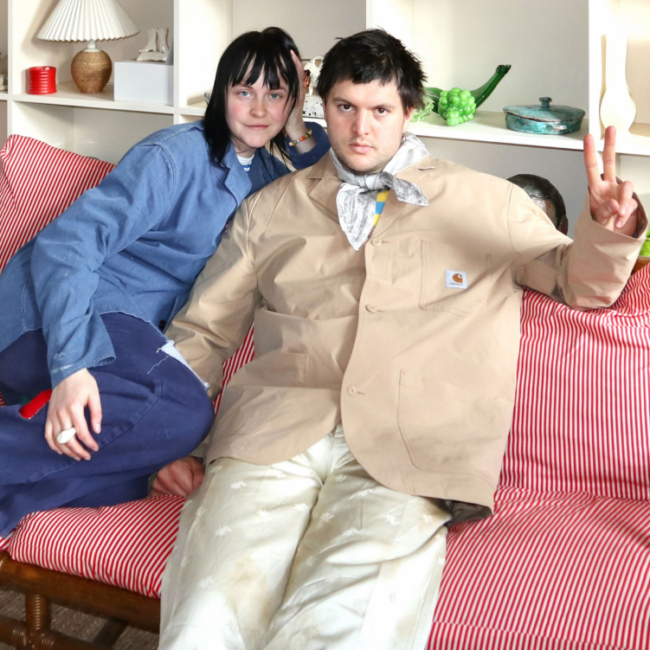
As big admirers of his work, we’re super thrilled to have collaborated with Michael on creating two Tylko Original Modern shelves that match his love for form and function. And, after talking to him about his creative journey, his passion for art and how he uses colour to elevate a room, we’re eager to share his valuable and very practical insights with our community. So, without further ado: everyone, meet Michael.
Hi Michael. For those who don’t know you yet, can you describe what you do?
I live from telling stories. And within those stories, I like to think there are different subcategories that are part of my everyday work and life. I’m mainly a creative consultant for design and architectural companies, primarily Scandinavian but also international. Meaning I help companies and brands define what they should look and sound like.
I’ve also recently opened a gallery with a good friend of mine, which is a project I feel very passionate about. It’s a space focused on showcasing young, contemporary, mostly Danish artists in a pop up context to make art a little more available for people like myself.
Then there’s my Instagram platform, which is also a business. Sometimes people ask me if I can make a living off being an influencer, and the truth is I really can’t! It’s just super, super nice for me to have this creative outlet as well. I define it as a professional hobby. My social media is a creative space where I share a lot of projects that are based around my apartment, and where I can showcase my personal perspective. So my account is not so much client work, but more focused on how I actually live.
Can you tell us a little about your background and what led you to where you are now?
I studied film and media at the University of Copenhagen, which I guess is not entirely related to what I do today – but it was media, so in that sense it is linked. Design has always just been a really big interest of mine. My dad studied architecture, my grandfather was an architect, and I was very close to also becoming an architect, but they said “No! Don’t do it.” So I didn’t do it – ha!
While I was at university, and some years after that, I worked as editor for different magazines here in Denmark, covering topics of design, fashion design, interior design and architecture. So I had this more editorial and journalistic approach to the design world, and then it slowly led me to where I am today. But I don’t define myself as a designer, even though I have a great passion for it, and I have actually designed a backpack, a chair, and a shelving system — I guess these projects are just an outcome of my busy mind, not really part of my pursuit of becoming a furniture designer.
Your home is absolutely dreamy. Did you inherit your eye for design from your family?
There’s actually quite some clear references that I can see now as an adult that stem from childhood influences, for sure. I grew up surrounded by a lot of classic architecture and this was always a big topic in my home. I remember being on vacation with my grandparents in France, and doing a 5-hour detour to see the Notre-Dame du Haut church by Le Corbusier — so things like that really stuck with me.
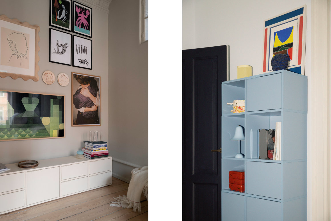
One quite clear reference that I always return to is this Danish painter called Vilhelm Lundstrøm, who worked in the first half of the 20th century and was really famous for using quite powerful colours, like blues and oranges. It seems like this balance of shape and colour is really something that I’m quite drawn to. So I do think there are these references from the past, but also of course you keep evolving all the time by living in different spaces, and just experiencing different phases of life I guess.
Since you brought up the topic of personal evolution: your style has of course changed throughout the years. In what ways, do you think?
I think it’s quite hard to notice the evolution of one’s visual expression while it’s going on. But it becomes clear to me when I look back at my work. If I look back at images of my home 10 years ago, for example, it still feels like me, but also quite different. One thing that really has changed is how I embrace colours a lot more than I would have done years ago. And I think that it has to do with me getting older. I don’t care as much about what’s trendy and what everybody’s doing — I trust my gut feeling more and just go for what I like. And then hopefully other people will like it too, but if they don’t, that’s okay.
Also, my interest in art has been evolving a lot since I started collecting art pieces around six years ago. And I think this progress is really not as different from studying any subject at school: the more you look at something, the more you read about something, the more you incorporate it into your work, the more you develop your own perception of it.
Going back to your interest in colour: you’ve got a real talent for mixing and matching palettes. What’s your thought process behind choosing the right colours and how does emotion play a role in your decision?
When I help people define colours for their homes, I really try to understand what the function of the room is. There are so many answers to be found in functionality and from exploring what sort of life you want to live in a certain space. And colours can be a tool to enhance that experience quite a lot. For instance, in my office where I’m sitting right now, I used quite dark colours because I want a really calm mood to be able to focus.
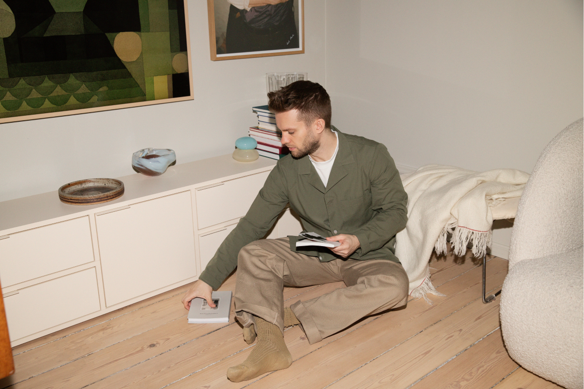
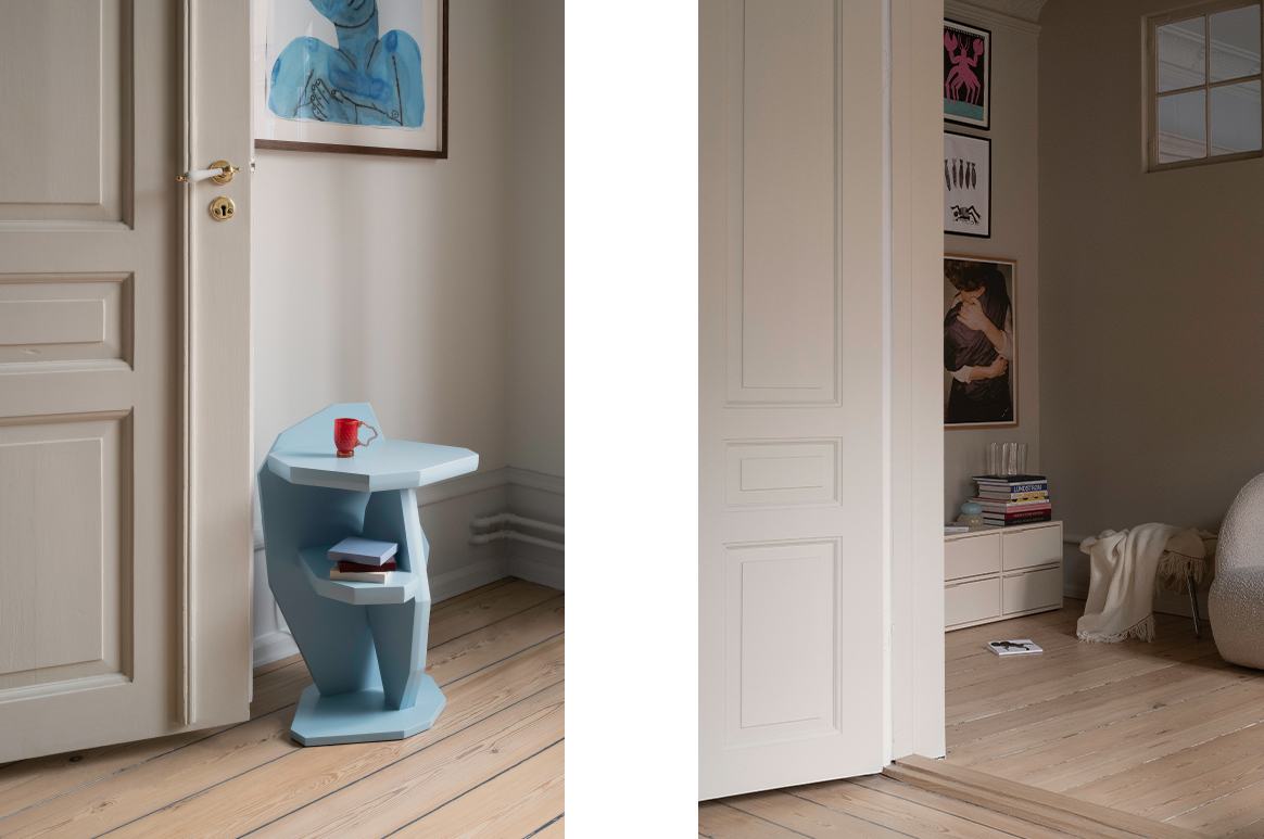
At home, people think that I live with a lot of colours because of what they see on my Instagram, but actually all the colours at eye level are natural hues, like off-white, which gives breathing space for art pieces and furniture. Where you do see colour is on the ceilings, which are quite tall and we wanted to open them up a bit more.
I really try to understand what sort of experience I want to offer people whilst they walk through each individual room. For example, one of the main rooms is the kitchen, and it gets a lot of sunshine. I wanted to embrace this light, so I worked a lot with different hues of yellow and orange. Yellows can be quite tricky to work with, actually, because they can be a little harsh — it’s all about achieving the right balance. Usually with these big surfaces, I prefer colours with a little dust and grain in them so they’re easier on the eye, and then I like using clear colours as small details.
Where do you find inspiration?
I am on social media a lot everyday, so even though this is probably the most boring answer, I can’t deny that it does influence me immensely. But I also really, really like print magazines as well and since I worked as an editor, I have quite a big collection.
What are some of your favourite magazines?
Right now I really enjoy Architectural Digest — it’s not very Scandinavian which I like, because it gives me a refreshing perspective on design. I also really enjoy British interior magazines, like House & Garden. It’s weird because the style is very different from my own, but I really love the almost overwhelming amount of prints they use.
Do you ever get tired of too much visual stimulation, and feel like you have to take a break?
My limit is quite high, so I can take in a lot. But what I do need is alone time, because my work is so social — I’m always meeting a lot of people and I’m constantly engaging with people’s lives. So I make sure I have the time and space to process all of these experiences. If I don’t do that enough, I feel overly stressed. So it’s all about balance again: if I take in a lot of inspiration, I just have to make sure I balance it out with alone time. Maybe that’s simply walking around the house, and enjoying every space, without focusing on a particular activity.
As you mentioned, art is a big part of your life. What do you seek for in the artworks you select for your pop up gallery and your home?
I’m sure if you studied art history you’d give a much more informed answer. Ha! But to me it’s just such a gut feeling experience — it’s about having an instant connection with something. I usually instinctively know if I like something or not and try to follow that feeling. But I can say that I am naturally drawn to works that challenge me in some way, or have an interesting balance of colours and shapes.
What are some of your favourite places to hang out in Copenhagen?
I live in Nørrebro, and I’m so lucky because that’s where all my favourite places are. I really like a wine bar that’s just around the corner from my place called Pompette.
But I also really enjoy an old part of Copenhagen, Frederiksstaden, that is in the very centre of the city, where you can find the queen’s palace and the marble church. This is where all the classic art galleries are, as well as furniture shops that sell pieces by iconic Danish designers from the 50s. You’ll also find a lot of contemporary stores — one of my favourites is called Studio x Viaduct, and they just opened a great coffee place around the corner called Studio x Kitchen. There’s also a super nice wine shop close by called Lille Blå winebar.
How was your experience with Tylko?
I was super impressed by how easy it was to navigate the website and design my shelf. To me, this was what stuck out the most: the fact that you can really decide the specific length or height of your furniture. Because usually I feel with these customisation tools, you don’t have this amount of freedom.
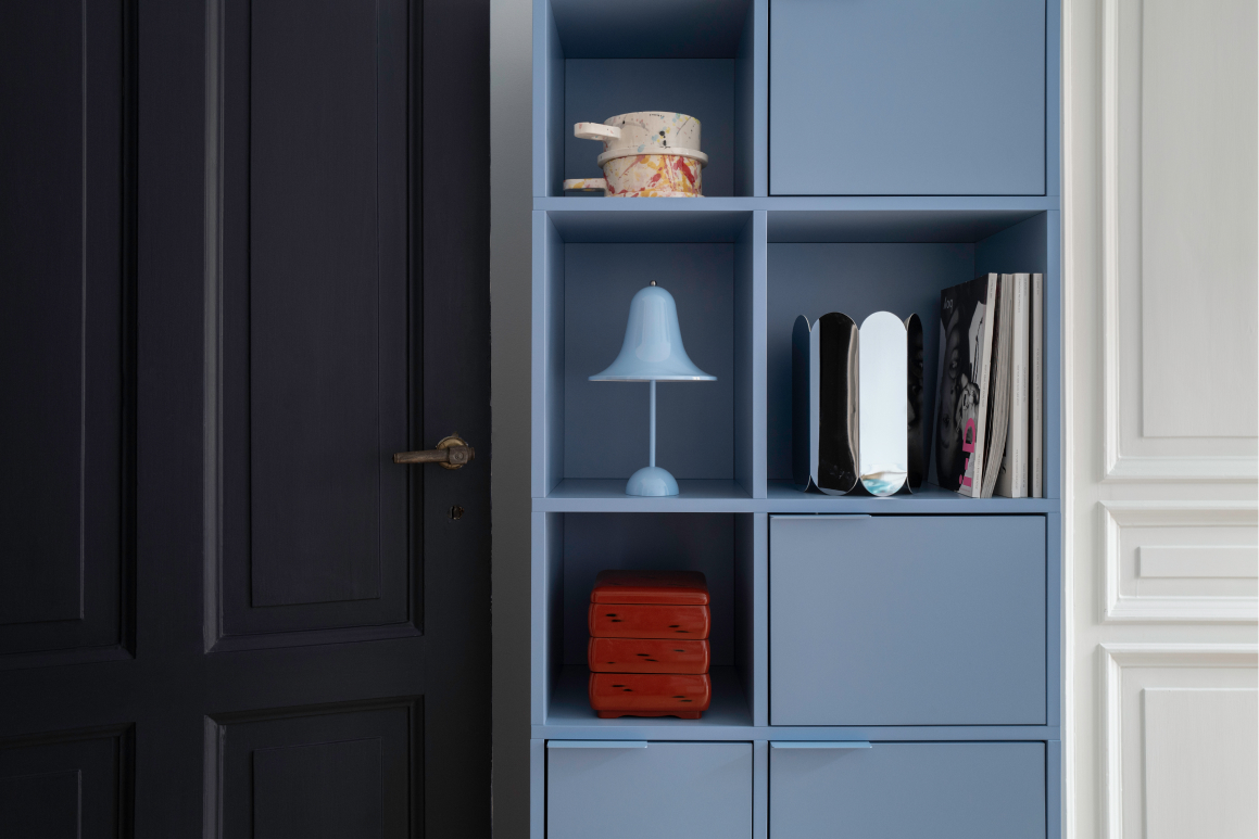
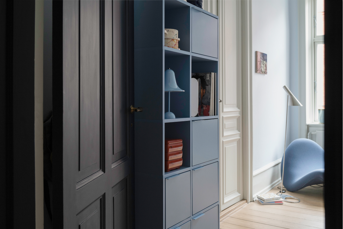
I was also really happy with my choice of colours. As I said, I love when colours have a graininess to them, and the hues I selected (Sky Blue and Cotton Beige) have that effect. I call these in between colours — they’re just easier on the eye.
As for the design of Tylko shelves, I really like the simplicity, and the balance between form and function. For our TV room, I wanted a system that was quite closed off, meaning not everything is on display. Since this is a room with a lot of textiles, and it gets quite dusty, I didn’t want to have a lot of open shelves. I also wanted to have as many drawers as possible for cables, catalogues, samples, etc. So the design is really simple and beautiful, but also extremely practical.
What does home mean to you?
Home, to me, has two main and quite contrasting functions: one is the very private function. I see it as a sanctuary and a place to recharge and process my day. But then, on the flipside, especially doing what I do: it’s got a very creative aspect to it too. My home is sort of my business card. It’s a way for me to express who I am, and showcase what I do and how I live.